Module 2b —
Report Writing
| Course Guide | Module 1 | Module 2a | Module 2b |
Activity 8: Improving visual elements
The following examples demonstrate the ineffective use of visual elements for a report. Try to determine what is wrong with each example and how it could be improved.
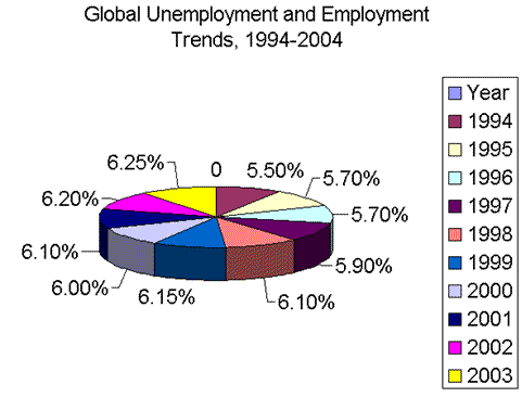
Example 1
|
|
Ineffective: The span of ten years does not really indicate parts of a whole. As well, the percentages are indicative of a trend rather than an accumulated total of 100%. Finally, there are too many colours to make for useful distinctions of information. |
|
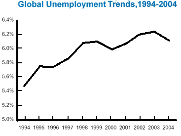
The same information here is displayed in a line graph, which is used to show the variations in the unemployment rate over time. A trend is evident from the presentation.
|
|
Example 2
|
|
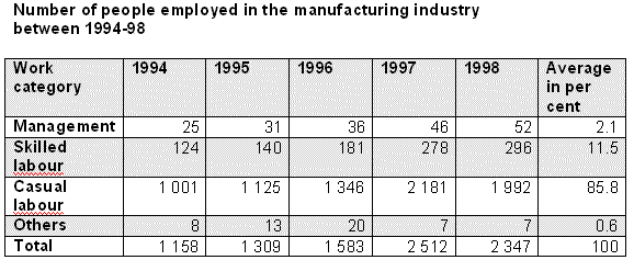
Ineffective: The shading is not used to distinguish the rows of information very well. It includes the top row, which is used to identify the categories. There is no formatting applied to distinguish the categories or the total. The table needs to be numbered and identified as a table for better referencing in the text. |
|
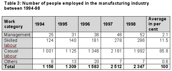
The shading is used here to separate out the categories from the information. The table is not so big that each row or column needs to be differentiated from the rest.
|
|
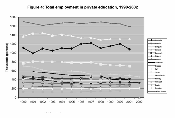
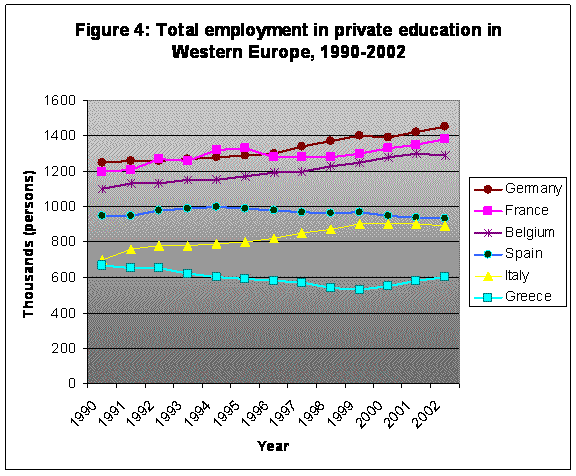
Example 3
|
|
Ineffective: This line graph demonstrates a common flaw in the use of visuals - namely, the temptation to cram in too many categories into a visual display so as to make the pertinent information all but invisible. The other problem with this graph is that because it is in black and white, it makes it extremely hard to distinguish which line belongs to which country. The result is a cluttered display of information that will not mean much to the reader. |
|
In a case like this one, it is more effective to use fewer categories of information so that it is easier to focus on the actual trends evident in the graph rather than being forced to interpret through the clutter. Even if all the information is required for your report, you may have to determine ways of presenting it in smaller data sets so that the message is simplified. Adding colour, if possible, will also enhancement graph’s value.
|
|