
Module 2b —
Report Writing
| Course Guide | Module 1 | Module 2a | Module 2b |
Graphs and charts
Software packages like Excel make it easy for writers to insert professional-looking graphs into Word reports.
Graphs make it visually easier for the reader to grasp general trends. However, for some readers who need the detail of actual figures, a table may be better. Always choose a method of presenting information graphically that fits with the reader's needs.
Types of graphs
Excel gives you access to a large range of graph types. Not all types are suitable for all tasks. The following gives you some guidance on which of the main types to use in various circumstances and shows some effective UNAIDS examples.
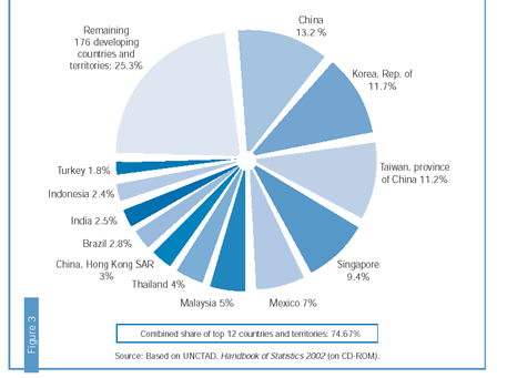
Pie graphs may be used to depict proportions that make up a whole, such as budget categories, or survey breakdowns such as below. Use pie graphs to show data as percentages of a whole, or in other words, in proportions.
138. This trade expansion did not occur uniformly across all countries, with the industrialized countries and a group of 12 developing countries accounting for the lion’s share. In contrast, the majority of developing countries did not experience significant trade expansion (Figure 3). Indeed, most of the Least-Developed Countries (LDCs), a group that includes most of the countries in sub- Saharan Africa, experienced a proportional decline in their share of world markets – despite the fact that many of these countries had implemented trade liberalization measures.
Fair Globalization. Page 25. |
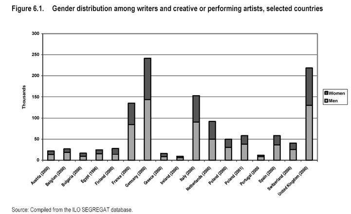
Bar graphs (histograms) may be used to show comparisons, distributions, or category tabulations. Although they are also sometimes used to show values that change over time, bar graphs usually compare discontinuous events, showing the differences between events, rather than trends.
The example below illustrates the distribution of work. The bars are used both to convey quantitative values and to compare the values between men and women.
The future of work and quality in the information society: The media, culture, graphical sector. Report for discussion at the Tripartite Meeting on the Future of Work and Quality in the Information Society: The Media, Culture, Graphical Sector Geneva, 2004. Page 82. |
Line graphs are a large family of graphs (varieties are scatter line graph, curve graph, line chart, vector graph, comparison graph, dual line graph, multiple line chart, overlapped line graph, compound line chart, area chart) that display qualitative information by means of lines; they are extremely versatile and are therefore used extensively.
As the following example illustrates, line graphs are best for showing continuous data over time set against a common scale.
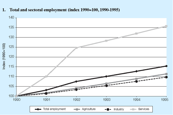
WORLD EMPLOYMENT REPORT 2004-05 Employment, Productivity and Poverty Reduction Released 7 December 2004. Page 52.