
Module 2b —
Report Writing
| Course Guide | Module 1 | Module 2a | Module 2b |
Relevance and purpose
Determine whether you need visual elements
Do not use a graph or image just to decorate. Your decision to present information visually should relate back to your purpose and your audience. If you think that a visual element will make a difference to your reader’s comprehension or reception of the information, then you should use it. If your reader has to guess why you’ve included a particular visual element, then it clearly is not serving your purposes and is instead a distraction.
Determine what kind of visual element to use
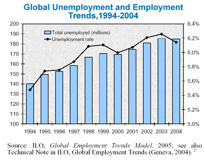
Statistical information is often better presented in visual format, through graphs, charts, or tables. However, you have to decide what type of format is most suitable for your reader.
Look at the following two presentations of the same information. Which one shows the information in a more meaningful way? In this case, conveying trends related to employment and unemployment is integral to the purpose of the report. Which one gives a better sense of the idea of a trend?
|
 |
|||||||||||||||||||||||||||||||||||||||