
Module 2b —
Report Writing
| Course Guide | Module 1 | Module 2a | Module 2b |
Formatting considerations
Placement
Ideally, you should place graphics just after the point where they are needed. If pagination makes this impossible, be sure to label accurately so that they can be easily found by the reader.
Notice in the following example of a “callout box” how the juxtaposition of two written elements visually enhances the reference to the Millennium Development Goals:
A fair globalization: Creating opportunities for all. Page 106. |

Size
Ideally you want illustrations to be between one half to one quarter of the vertical size of the page. You want them to fit on the page interspersed with text.
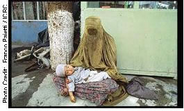 |
Twenty-three years of war have ravaged the mental health and psychosocial functioning of the people in Afghanistan. Killing, executions, massive persecution, forced internal displacement, fear associated with living in mined areas, and the latest escalation of violence have left an indelible mark on the population. In addition, the psychological impact of living in uncertainty affects at least three million Afghan refugees. |
Margins
Make sure that your graphics fit neatly and comfortably within standard margins. Don't have the graphic spilling over into the right or left margins. (You can, however, place images effectively outside the text frame if your page design has adequate white space available.)
Allow the equivalent of at least two blank lines above and below the graphic.
Level of technical detail
Pitch your graphics at the right level for your readers. No chip circuitry diagrams for computer beginners!
Key
If the graphic has shadings, colours, line styles, or other details that have a special meaning in the illustration, these should be indicated in a key in an unused corner of the illustration that deciphers their meaning.
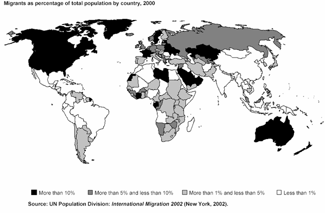
Towards a fair deal for migrant workers in the global economy. International Labour Conference, 92 session, 2004. Report 6 |
Title
Except in special cases, graphics should have titles, and these titles should be numbered (Figure 1, Figure 2, and so on). Tables and figures should use separate numbering sequences. In long reports, figures are often listed in their own table of contents.